A blog series distilling quantitative concepts /use-cases in CRM Analytics (Einstein Analytics)
|
After creating the dataset that contains a flatten transformation, you need to modify the dataset XMD and turn 'isSystemField' to 'false' . This will enable user to see the field in a lens to debug.
CODE BELOW { "flattnMgr": { "schema": { "objects": [ { "label": "ManagerPathText", "fields": [ { "name": "mgrPath", "label": "mgrPath", "isSystemField": false }, { "name": "ManagersList", "label": "ManagersList", "isSystemField": false } ] } ] }, "action": "flatten", "parameters": { "include_self_id": false, "self_field": "Id", "multi_field": "ManagersList", "parent_field": "ManagerId", "path_field": "mgrPath", "source": "LoadUser" } }
0 Comments
so let's say you have a set of metrics that you want to create a time-series on. Maybe your team makes sales forecast on clients that changes over time. You can take a 'snapshot' of that forcast daily thru a scheduled dataflow and an append transformation node. At the end of a certain period your dataset may look like this... Client Date Forecast A January 3 $1000 B January 3 $5000 A March 2 $2000 B March 2 $3000 Code below creates a waterfall chart with a binding to control the grouping trigger. q = load \"zds_IoTForecast5\";\nstartVal = filter q by {{column(qDateTest_1.selection,[\"cTimeStampText\"]).asEquality('cTimeStampText')}};\nendVal = filter q by {{column(q_SnapDate2_1.selection,[\"cTimeStampText\"]).asEquality('cTimeStampText')}};\nq_A = filter q by {{column(qDateTest_1.selection,[\"cTimeStampText\"]).asEquality('cTimeStampText')}};\nq_B = filter q by {{column(q_SnapDate2_1.selection,[\"cTimeStampText\"]).asEquality('cTimeStampText')}};\nstartVal = group startVal by all;\nstartVal = foreach startVal generate \"Start Value\" as '{{column(static_6.selection,[\"Valu\"]).asObject()}}',number_to_string(sum (startVal.'TotValueUSD'),\"$#,###\") as 'Forecast Delta';\nendVal = group endVal by all;\nresult = group q_A by '{{column(static_6.selection,[\"Valu\"]).asObject()}}' full, q_B by '{{column(static_6.selection,[\"Valu\"]).asObject()}}';\nresult = foreach result generate coalesce(q_A.'{{column(static_6.selection,[\"Valu\"]).asObject()}}', q_B.'{{column(static_6.selection,[\"Valu\"]).asObject()}}') as '{{column(static_6.selection,[\"Valu\"]).asObject()}}',coalesce(sum(q_A.'TotValueUSD'),0) as 'A', coalesce(sum(q_B.'TotValueUSD'),0) as 'B';\nresult = foreach result generate '{{column(static_6.selection,[\"Valu\"]).asObject()}}',number_to_string( B-A,\"$#,###\") as 'Forecast Delta';\nendVal = foreach endVal generate \"Ending Value\" as '{{column(static_6.selection,[\"Valu\"]).asObject()}}',number_to_string(sum (endVal.'TotValueUSD'),\"$#,###\") as 'Forecast Delta';\nresult = order result by '{{column(static_6.selection,[\"Valu\"]).asObject()}}' asc;\nfinal = union startVal,result,endVal; 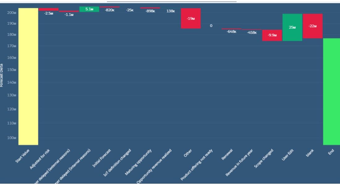 The flatten transformation is a powerful node for flattening heirarchy. A typical use-case is for enforcing 'who sees what' up the reporting chain through the use of security predicates. Code below details the steps in tweakign the JSON of the dataflow to be able to see the heirarchy in string form. This is used for debugging purposes. As an example, if you have a flatten node to see the id and the managers id and the manager of the manager,etc, you need to add the schema section in the JSON in order for you to see the manager path in the UI part of the lens in TCRM.
{ "flattnMgr": { "schema": { "objects": [ { "label": "ManagerPathText", "fields": [ { "name": "mgrPath", "label": "mgrPath", "isSystemField": false }, { "name": "ManagersList", "label": "ManagersList", "isSystemField": false } ] } ] }, "action": "flatten", "parameters": { "include_self_id": false, "self_field": "Id", "multi_field": "ManagersList", "parent_field": "ManagerId", "path_field": "mgrPath", "source": "LoadUser" } } q = load \"zds_OpptySnapshot\";\nq1 = filter q by {{column(timeStampText_4.selection,[\"Snapshot1\"]).asEquality('timeStampText')}};\nq1 = filter q1 by date('CloseDate_Year', 'CloseDate_Month', 'CloseDate_Day') in {{cell(static_2.selection,0,\"Valu\").asString()}};\nq2 = filter q by {{column(timeStampText_5.selection,[\"Snapshot2\"]).asEquality('timeStampText')}};\nq2 = filter q2 by date('CloseDate_Year', 'CloseDate_Month', 'CloseDate_Day') in {{cell(q_FY2_1.selection,0,\"Valu\").asString()}};\nresult = group q1 by 'Stage' full, q2 by 'Stage';\nresult = foreach result generate coalesce(q1.'Stage', q2.'Stage') as 'Stage', number_to_string(sum(q1.'Amt'), \"$#,####\") as 'Snapshot1 Amt',number_to_string(sum(q2.'Amt'), \"$#,####\") as 'Snapshot2 Amt', number_to_string((sum(q1.'Amt')- sum(q2.'Amt')), \"$#,####\") as 'Difference';\nresult = order result by ('Stage' asc);\nq3 = filter q by {{column(timeStampText_4.selection,[\"Snapshot1\"]).asEquality('timeStampText')}};\nq3 = filter q3 by date('CloseDate_Year', 'CloseDate_Month', 'CloseDate_Day') in {{cell(static_2.selection,0,\"Valu\").asString()}};\nq4 = filter q by {{column(timeStampText_5.selection,[\"Snapshot2\"]).asEquality('timeStampText')}};\nq4 = filter q4 by date('CloseDate_Year', 'CloseDate_Month', 'CloseDate_Day') in {{cell(q_FY2_1.selection,0,\"Valu\").asString()}};\ntot = cogroup q3 by all full,q4 by all;\ntot = foreach tot generate \"Totals\" as 'Stage', number_to_string(sum(q3.'Amt'), \"$#,####\") as'Snapshot1 Amt', number_to_string(sum(q4.'Amt'), \"$#,####\") as 'Snapshot2 Amt', number_to_string((sum(q3.'Amt')- sum(q4.'Amt')), \"$#,####\") as 'Difference';\nfinal =union tot,result;\n",
"receiveFacetSource": { So let's say you are able to plot out an object through time using a dataflow loop. You would have a set of data (eg. a snapshot of open opportunities every day that runs every 5am.) In addition to plotting this time-series, you want to plot changes from snapshot Date1 to snapshot Date 2 grouped by a certain field like per zip code, or region, or business unit,etc. Below is a snip of the waterfall chart and its SAQL q = load \"zds_IoTForecast5\";\nstartVal = filter q by {{column(qDateTest_1.selection,[\"cTimeStampText\"]).asEquality('cTimeStampText')}};\nendVal = filter q by {{column(q_SnapDate2_1.selection,[\"cTimeStampText\"]).asEquality('cTimeStampText')}};\nq_A = filter q by {{column(qDateTest_1.selection,[\"cTimeStampText\"]).asEquality('cTimeStampText')}};\nq_B = filter q by {{column(q_SnapDate2_1.selection,[\"cTimeStampText\"]).asEquality('cTimeStampText')}};\nstartVal = group startVal by all;\nstartVal = foreach startVal generate \"Start Value\" as '{{column(static_6.selection,[\"Valu\"]).asObject()}}',number_to_string(sum (startVal.'TotValueUSD'),\"$#,###\") as 'Forecast Delta';\nendVal = group endVal by all;\nresult = group q_A by '{{column(static_6.selection,[\"Valu\"]).asObject()}}' full, q_B by '{{column(static_6.selection,[\"Valu\"]).asObject()}}';\nresult = foreach result generate coalesce(q_A.'{{column(static_6.selection,[\"Valu\"]).asObject()}}', q_B.'{{column(static_6.selection,[\"Valu\"]).asObject()}}') as '{{column(static_6.selection,[\"Valu\"]).asObject()}}',coalesce(sum(q_A.'TotValueUSD'),0) as 'A', coalesce(sum(q_B.'TotValueUSD'),0) as 'B';\nresult = foreach result generate '{{column(static_6.selection,[\"Valu\"]).asObject()}}',number_to_string( B-A,\"$#,###\") as 'Forecast Delta';\nendVal = foreach endVal generate \"Ending Value\" as '{{column(static_6.selection,[\"Valu\"]).asObject()}}',number_to_string(sum (endVal.'TotValueUSD'),\"$#,###\") as 'Forecast Delta';\nresult = order result by '{{column(static_6.selection,[\"Valu\"]).asObject()}}' asc;\nfinal = union startVal,result,endVal;  replace the generate statement with number_to_string(sum (startVal.'TotValueUSD'),\"$#,###\") as 'Forecast Delta'
Here is how to set your y-values dynamically so it is not set to zero all the time. Having this functionality enables user to view data at a better angle since the variance will be more 'pronounced' by not having the minimum value start at zero all the time. Go into the dashboard, find the widget and set the JSON to the following.
."measureAxis1": { "sqrtScale": true, "showTitle": true, "showAxis": true, "title": "", "customDomain": { "low": "{{column(q_AxisDomain_1.result,[\"lowest\"]).asObject()}}", "showDomain": true "query": "q = load \"zds_IoTForecast5\";\nstartVal = filter q by {{column(qDateTest_1.selection,[\"cTimeStampText\"]).asEquality('cTimeStampText')}};\nendVal = filter q by {{column(q_SnapDate2_1.selection,[\"cTimeStampText\"]).asEquality('cTimeStampText')}};\nresult = group startVal by all full, endVal by all;\nresult = foreach result generate ( (sum(endVal.'TotValueUSD') + sum(startVal.'TotValueUSD'))/2) *.5 as 'Avg',(case when sum(endVal.'TotValueUSD') < sum(startVal.'TotValueUSD') then (sum(endVal.'TotValueUSD')) * .95 else (sum(startVal.'TotValueUSD'))*.95 end) as 'lowest';", Here is a use case where null values are backfilled with 'unspec' or different texts depending on certain values of a field called timeUntil.Using a compute expression with a text type, enter the statement in the SAQL expression.
case when 'Date_Time_Priority_Assigned__c' is null then "Unspec" when 'Time_Until_Prioritized_Days__c' >0 and 'Time_Until_Prioritized_Days__c' <=1 then "Prioritized w/in 24 Hrs." when 'Time_Until_Prioritized_Days__c' >1 and 'Time_Until_Prioritized_Days__c' <= 2 then "Prioritized within 48 Hrs." when 'Time_Until_Prioritized_Days__c' >2 then "Prioritized after 48 Hrs." else "Unspec" end I found a really interesting use-case for using the 'lookup multi value' switch in an augment transformation for the global firm I currently work in. For simplicity's sake, let's say company X has 4 external vendors in APAC - Singapore, Thailand, Philippines and Vietnam. Each of the 4 AE's should only see opportunities that they serve. The not so easy part is that the 4 are NOT the opportunity owners and are linked mainly to the oppty by region. Graphically it looks something like
Oppty Region Oppty Owner A Vietnam John B Philippines Jill C Singapore James D Vietnam Henry The 4 external vendors are Kyle , Rob Vietnam Rudy Philippines Sam Singapore When Kyle logs into Salesforce, he should only see oppty A and D / Sam should only see oppty C. q: How can this be implemented given that the only link between the 4 to any opptys is thru the Region field? a: Create an excel sheet listing the 4 vendors and their regions, bring it into Einstein , load it as an edgemart node THEN AUGMENT IT TO THE OPPTY OBJECT USING multi-value joined by?...... Region Afterwards, you would end up with a table like this. Oppty Region Oppty Owner Vendors A Vietnam John [Kyle, Rob] B Phil Jill [Rudy], etc.. After you build this table, next and last step is to register the dataset and attach this as a security predicate (in pseudocode): 'Vendors' == "$User.name" Steps in creating a Salesforce Einstein external connector which enables you to connect to an external instance of Salesforce. It is a great way to achieve roll-up reporting or develop in a sandbox but have fresh data for Discovery development.
1) Analytics Studio > Data Manager >Connect 2)Create Connection and find appropriate connector-ie Heroku, , Azure… for this use-case pick Salesforce external connector. 3)Go to the destination instance and generate a securitytoken by clicking on your user profile and settings then ‘reset my security token’ 4) wait for the email, cut the security token (eg. 8ItzDv0matM8stuyuhT5uXXXs) 5)in the Setup your connection dialogue box, create a connection name/developer name/description and enter your username and password that you use to login to the destination instance. 6)append the security token to your password. So if your password is ‘mypassword’, that box should be ‘mypassword8ItzDv0matM8stuyuhT5uXXXs’ 7)click ‘save and test’ and hope to get ‘connection successful’ message. 8) Once the connector is up and running , you can add the objects that you need and their fields. Run the connector or schedule it to run periodically. 9) In a dataflow, create a digest node and pick the connector name and object from the list. So let's say you have 2 fields in a custom object- ID and Estimate and you want to see how the estimate value changes over time. One approach would be to take a 'snapshot' of this data periodically --- daily, weekly,etc. Create a dataflow on a schedule and attach the following nodes to it.
1) create a data variable called 'snapshotDt' thru the use of a computeExpression node using the following formula > toDate(date_to_string(now(),"yyyy-MM-dd"),"yyyy-MM-dd") with the date format yyyy-MM-dd in the other drop-down boxes. 2) AFTER this node, create another computeExpression node and create a textfield of the same snapShotDt in order to make databindings in the dashboard simpler since you are dealing with 1 text field instead of three fields- year,month day. The settings in the computeExpression > text / SAQL expression toString(toDate('snapShotDt_sec_epoch'),"yyyy-MM-dd") 3) Make sure the object is initialized because the table will be recursively appended. Any misaligned fields will cause a dataFlow exeception. How? introduce an artificial date text for the 1st row then fire off scheduled flows to append to it going forward. So this is a use-case requested by a non-profit org ("NPO"). They are using a variant of LYBUNT ('Last year but unfortunately not this year and SYBUNT ('some years...") report to track donations. There are several issues to consider for this particular ask. The first is that the NPO wants the reports to track fiscal year donations. This means that the org should have fiscal year enabled. Assuming it is enabled, the complexity is picking out accounts that had donations last FY and did not make any donation this FY OR ANY OTHER combinations thereafter. It is somewhat complex on the CRM side. (This would be a breeze using the Einstein / Tableau CRM platform but we will reserve that discussion for another day.) Illustratively, given the following donation records for account A and B, last FY being June1, 2019-May 30,2020 the report should pick out only account B if you want donations last FY year and donations this year. In addition, one can use the logical operators of <,>,== to create other variations.(ie no donations LY, but this FY,etc.) Account A , donated $100 with CloseDate = June 2,2017 Account B, donated $50 with CloseDate = June 2, 2019 Account B, donated $10 with CloseDate = Jan 20,2021 Account C, donated $75 with CloseDate = June 5, 2019 Here are the steps: 1) create a custom field "lastFY" with a rollup summary formula. This resolves to number datatype and is a rollup summary from the opportunity object (aka donations in the NPSP app). The snip of the formula is below. 2) create a report with the following filters. By varying the logical operators, you can create different reports as described above. 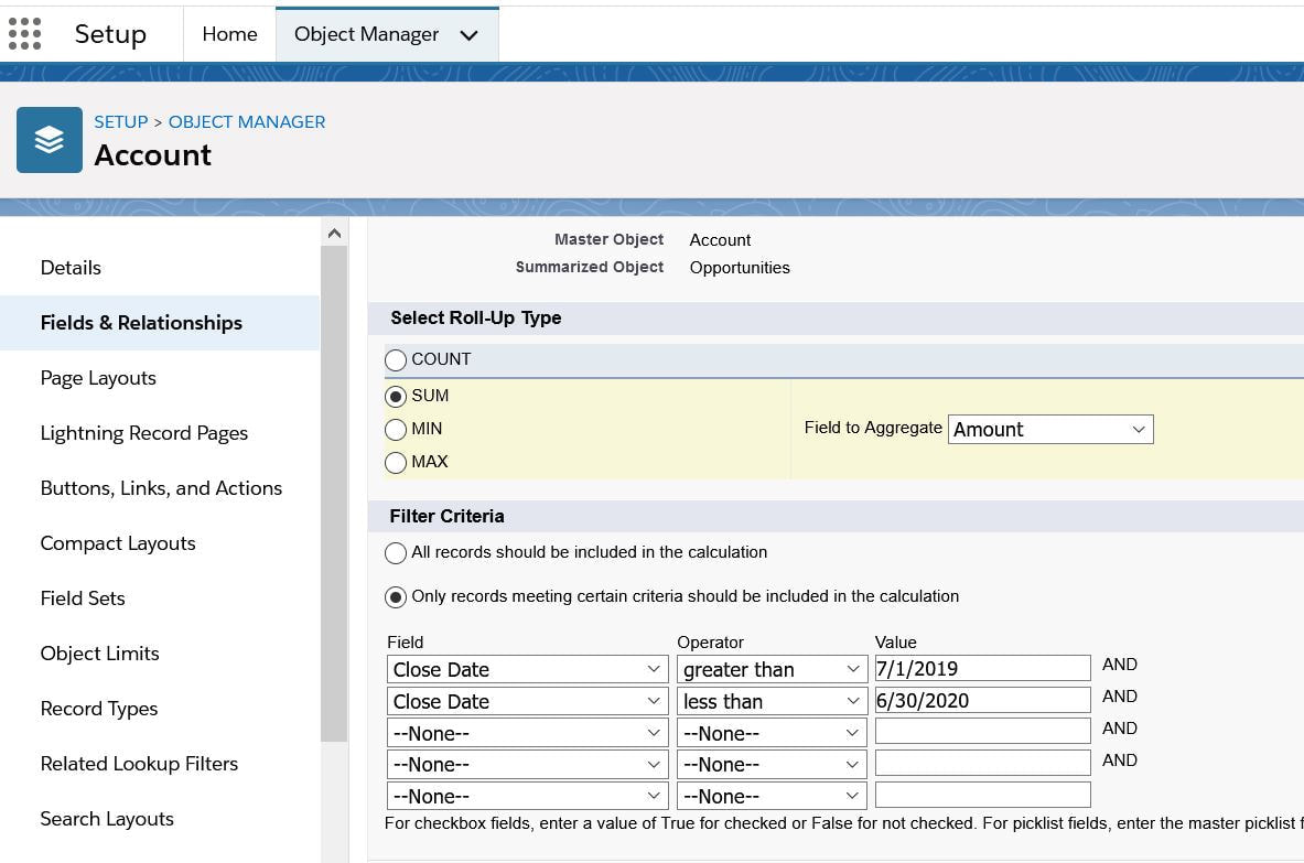 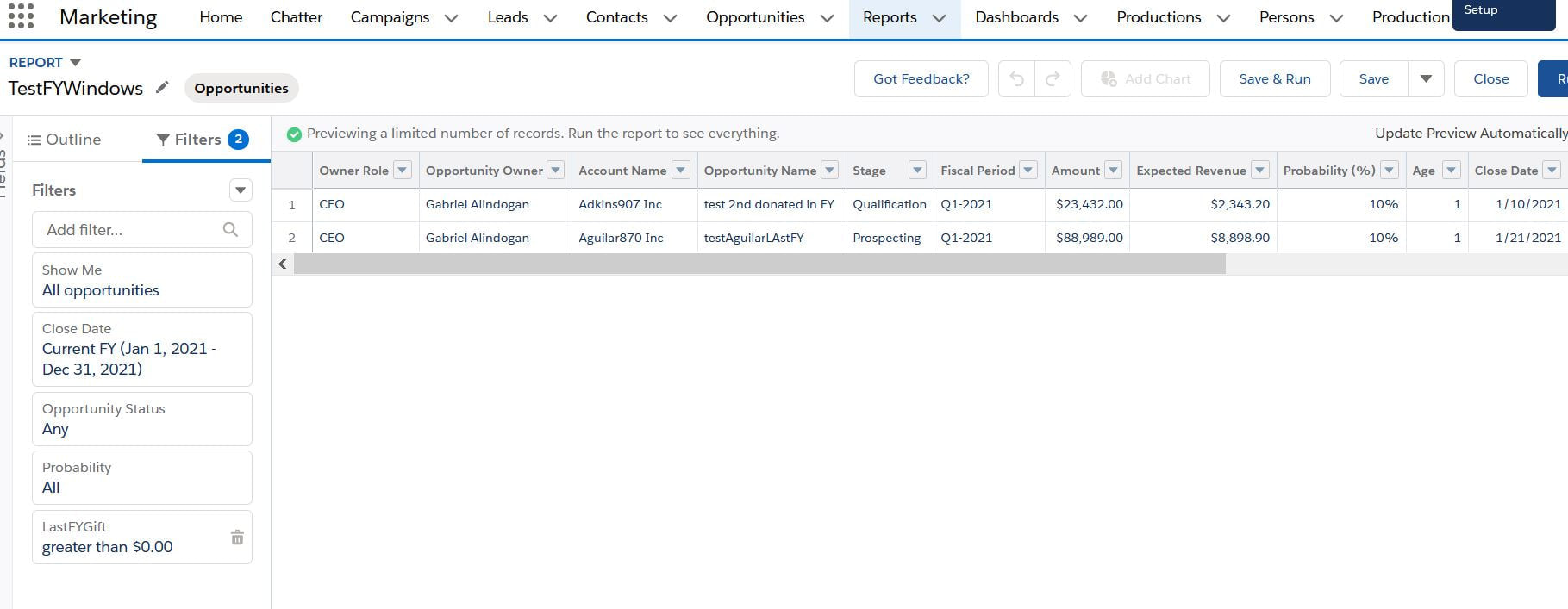 Data Science 101
Great video by Salesforce about different model metrics in Einstein Discovery. Precision, recall, accuracy and the versatile F1 score are discussed. A must view for aspiring data scientists. https://salesforce.vidyard.com/watch/5UpTbk6D24GdBzyZof2dWf?video_id=8801025 So let's say you have 1 million rows of data, grouped into 200 categories (eg... by Product Code)and you are only interested in the top 100 product codes while bucketing the remaining 100 under "Other". Implement this easily by using multiple data streams. In the SAQL below there are 2 data streams labeled q and q1. The limit or top "X" is determined by a toggle which is then implanted in the SAQL thru bindings. Here is the SAQL in non-compact form.
--first data stream q = load \"zDSForecastXProductLineItem\"; q = group q by {{column(static_1.selection,[\"Val\"]).asObject()}}; q = foreach q generate {{column(static_1.selection,[\"Val\"]).asObject()}} as '{{column(static_1.selection,[\"Val\"]).asObject()}}', sum('Total_Value__c') as 'TotValue'; q = order q by 'TotValue' desc; --top N as a binding q = limit q {{column(static_2.selection,[\"lmt\"]).asObject()}}; --2nd data stream q1 = load \"zDSForecastXProductLineItem\"; q1 = group q1 by {{column(static_1.selection,[\"Val\"]).asObject()}}; q1 = foreach q1 generate {{column(static_1.selection,[\"Val\"]).asObject()}} as '{{column(static_1.selection,[\"Val\"]).asObject()}}' ,sum('Total_Value__c') as 'TotValue'; --the "OFFSET" excludes the top N form 1st DS q1 = order q1 by 'TotValue' desc;q1=offset q1 {{column(static_2.selection,[\"lmt\"]).asObject()}}; --these next statements takes the "others" and buckets them into 1 group ie "all" then reprojects q1 = group q1 by all; q1 = foreach q1 generate \"Other\" as '{{column(static_1.selection,[\"Val\"]).asObject()}}', sum('TotValue') as 'TotValue'; --last one generates a datastream called "final" which unions both data stream. final=union q,q1; To filter using sets use the 'in' keyword. So let's say there is a field called firmRole which has following values - manager, supervisor,executive and you only want to filter the 1st and 3rd, you would add a filter node and check "use SAQL " and enter the following filter. 'firmRole' in ["manager","executive"];
* null values ARE NOT included in lenses,etc which may result in inaccurate row counts. Always try to bin nulls into 'unspecified'.
In certain use cases, null values need to be backfilled with stubs in order to properly group or summarize. In example below, SAQL is used to fill null values of Grades with the text 'unspecified'. Step 1: Create a compute expression, add field called 'backfill me' Step 2: Choosing text type, type expression in SAQL Expression box. case when 'Grades__c' is null then "UnspecGrade" else 'Grades__c' end I like the flexibility of the non-compact SAQL, however when it comes to having flexible groupings using bindings, I haven't had much success in using the non-compact form so below is the code for the aggregateflex compact form. Let's say you want a table that shows revenues but you want to create a toggle switch composed of 'region' , 'sales office' and 'country'. One day you want to see revenues by 'region' so table will have 2 columns (region and revenues), other times you want to see it by region and country--ie 3 columns > region , country and revenue.. and so on. this can be accomplised by creating a query, loading the dataset, creating groups, then tweaking the "grouping" by inserting a binding. Code below has 2 bindings- a string filter for fiscal period and grouping. BOTH are selection bindings. Be aware of the line "groups": "{{column(static_3.selection,[\"Valu\"]).asObject()}}",
When using the UI, groups will resolve to [], you need to take out the [] so it does not expect a list. { "query": { "measures": [ [ "sum", "GP_IOT__c" ] ], "groups": "{{column(static_3.selection,[\"Valu\"]).asObject()}}", "filters": [ [ "IoT_Fiscal_Period__c", [ "{{column(cFiscalPeriod_3.selection,[\"FiscalPeriod\"]).asObject()}}" ], "==" ] ] } }, { "query": { "measures": [ [ "count", "*" ] ], "formula": "B - A", "groups": "{{column(static_3.selection,[\"Valu\"]).asObject()}}" }, "header": "GP$ Delta" }, At first glance, this seems like a trivial use-case. First, contacts that were sent emails in 2018 and 2019 need to be counted.Afterwards all those contacts will be considered 'lasped' if their emails bounced in 2020 or emails not opened in 2020. I had to extract the year because the date field containing email opened and email bounced were in string form so I had to use the len() function since dates can be in xx/xx/2020 or x/x/2020 or x/xx/2020 form.Here is the function substr('Date_Email_Opened',len('Date_Email_Opened') -3,4). Two fields were created-openedYr and bouncedYr. The left part of the snip below represents the raw data with derived fields from above added on right. In addition, 2 compute relative transformations were added to create 'bouncedIn2020' and 'openedIn2020' fields. After dataset creation, it becomes a simple cogroup in SAQL to bring out the different totals 1)# of contacts with emails sent in 2018-19 2)from that list, number of contacts where no emails were sent in 2020 or bounced in 2020. 3) % of lapsed = list2 / list 1 q = load "zds_processedYears"; q_B = filter q by 'OpenedYear' in ["2018", "2019"]; q_C = filter q by 'OpenedYear' in ["2018", "2019"] && ('openedIn2020' == "false" or 'bouncedIn2020' =="true"); result = group q by all full, q_B by all full, q_C by all; result = foreach result generate count(q) as 'RawData', unique(q_B.'Contact_Id') as 'EmailSent2yrs', unique(q_C.'Contact_Id') as 'SentButNo2020OrBounced2020', unique(q_C.'Contact_Id') / unique(q_B.'Contact_Id') as 'lapsedPercentage'; 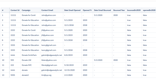 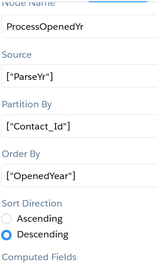 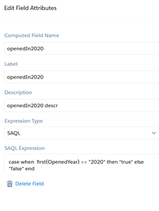    Step 1: Create a static query with columns that represent the strings you want to pass into the SAQL.In the example below we are passing three values labeled "Value", "Value2", and "Value3". Value 1 = 'CreatedDate_Year', 'CreatedDate_Month' Value2 = 'CreatedDate_Year', 'CreatedDate_Month', "Y-M" Value3 = 'CreatedDate_Year' + "~~~" + 'CreatedDate_Month' as 'CreatedDate_Year~~~CreatedDate_Month' Create another entry for Year-Week combination. Step 2: create the SAQL statement using the UI then <alt> E to alter the JSON. An example is "query": "q = load \"zds_OpptyLineItem\";\nq = group q by ({{cell(static_1.selection,0,\"Value\").asString()}});\nq = foreach q generate {{cell(static_1.selection,0,\"Value\").asString()}}, sum('Annual_Revenue__c') as 'Annual_Revenue';\nq = fill q by (dateCols=({{cell(static_1.selection,0,\"Value2\").asString()}})); If you want to apply formatting to an Einstein dataset, you can go to dataset > edit dataset, then locate 'Extended Metadata File top right and download it. Paste it on an online JSON editor to make your life easier, then add formatting there. After saving it, go back to the edit dataset and Replace the json with the new one you just edited. Going forward, any dashboard,lens that uses this dataset will default to the settings you specified in the XMD. The code below takes the skeleton XMD and adds formatting on 2 fields GP$ and TotValue. The initial XMD had an empty list. The bolded code was added which turned those fields from something like 43,203.11 to $43203 in any future dashboards.
{"dataset":{},"dates":[],"derivedDimensions":[],"derivedMeasures":[],"dimensions":[],"measures":[ { "field": "TotValueUSD", "format": { "customFormat": "[\"$#,###,###\",1]" }, "label": "Tot Value (USD)", "showInExplorer": true },{ "field": "GPDollarsUSD", "format": { "customFormat": "[\"$#,###,###\",1]" }, "label": "GP$ (USD)", "showInExplorer": true}],"organizations":[],"showDetailsDefaultFields":[]} In fact, we found that people embrace AI’s recommendations as long as AI works in partnership with humans. For instance, in one experiment, we framed AI as augmented intelligence that enhances and supports human recommenders rather than replacing them. The AI-human hybrid recommender fared as well as the human-only recommender even when experiential and sensory considerations were important. These findings are important because they represent the first empirical test of augmented intelligence that focuses on AI’s assistive role in advancing human capabilities, rather than as an alternative to humans, which is how it is typically perceived.
To calculate the elapsed # of days between a date field in an Einstein dataset and a string date field, use the daysBetween and toDate functions. The number multipliers have to do with epoch seconds.. Thanks for Pedro Gagliardi for his blog "Mastering Dates on Einstein Analytics using epochs". Here are the calculations.
1 hour = 3600 seconds 1 day = 86400 seconds 1 week = 604800 seconds 1 month (30.44 days) = 2629743 seconds 1 year (365.24 days) = 31556926 seconds Here is a compute expression transformation in a data flow which is of type number.: daysBetween( toDate('hdr2OLI.user2Oppty.CreatedDate_sec_epoch'),toDate(( ( string_to_number( substr("09/01/2020",1,2)) - 1 ) * 2629742 ) + ( ( string_to_number(substr("09/01/2020",4,2)) - 1) * 86400 ) + ( (string_to_number(substr("09/01/2020",7,4) )-1970) * 31556926) ) ) Bindings enable the user to interact with the dashboard for flexibility in data visualization. Example below compares using bindings for non-compact and compact SAQL. The 1st is a SAQL in noncompact form which compares a text date (ie cTimeStamp=cTimeStampText) using .AsEquality. The 2nd is an aggregate Flex compact form in the "filters" statement. "query": "q = load \"zDSForecastXProductLineItem\";\nq = filter q by {{column(qDateTest_1.selection,[\"cTimeStampText\"]).asEquality('cTimeStampText')}};\nq = group q by 'cBUBilling';\nq = foreach q generate 'cBUBilling' as 'cBUBilling', sum('Total_Value__c') as 'sum_Total_Value__c';\nq = order q by 'cBUBilling' asc;\nq = limit q 2000;", "query": { "measures": [ [ "count", "*" ] ], "groups": [ "cBUBilling" ], "filters": [ [ "cTimeStampText", [ "{{column(qDateTest_1.selection, [\"cTimeStampText\"]).asObject()}}" ], "==" ] ] } "qDateTest_1": { "broadcastFacet": false, "datasets": [ { "id": "0Fb3u000000c7u7CAA", "label": "zDSForecastXProductLineItem", "name": "zDSForecastXProductLineItem", "url": "/services/data/v48.0/wave/datasets/0Fb3u000000c7u7CAA" } ], "isGlobal": false, "label": "qDateTest", "query": { "measures": [ [ "count", "*" ] ], "groups": [ "cTimeStampText" ] Bindings enable the user to interact with the dashboard for flexibility in data visualization. Example below compares using bindings for non-compact and compact SAQL. The 1st is a SAQL in noncompact form which compares a text date (ie cTimeStamp=cTimeStampText) using .AsEquality. The 2nd is an aggregate Flex compact form in the "filters" statement. "query": "q = load \"zDSForecastXProductLineItem\";\nq = filter q by {{column(qDateTest_1.selection,[\"cTimeStampText\"]).asEquality('cTimeStampText')}};\nq = group q by 'cBUBilling';\nq = foreach q generate 'cBUBilling' as 'cBUBilling', sum('Total_Value__c') as 'sum_Total_Value__c';\nq = order q by 'cBUBilling' asc;\nq = limit q 2000;", "query": { "measures": [ [ "count", "*" ] ], "groups": [ "cBUBilling" ], "filters": [ [ "cTimeStampText", [ "{{column(qDateTest_1.selection, [\"cTimeStampText\"]).asObject()}}" ], "==" ] ] } "qDateTest_1": { "broadcastFacet": false, "datasets": [ { "id": "0Fb3u000000c7u7CAA", "label": "zDSForecastXProductLineItem", "name": "zDSForecastXProductLineItem", "url": "/services/data/v48.0/wave/datasets/0Fb3u000000c7u7CAA" } ], "isGlobal": false, "label": "qDateTest", "query": { "measures": [ [ "count", "*" ] ], "groups": [ "cTimeStampText" ] 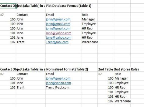 Table 1 below shows a Contact Object (or Table) in denormalized form. It has some redundant information such as email (ex.John's email needs to be stored 3x and Jane's 2x). Table 2 below shows the same information in a more efficient manner. Now there are 2 tables. The first table called Contact stores ID, contact and email, with the 2nd table storing Roles. The 2 tables are connected to each other by a 'KEY'. In this example, the ID field serves as the key. Normalized data is the main type of data structure used in modern databases today--primarily adopted to avoid redundancies, improve performance and minimize storage requirements.
However, there are some use-cases in Einstein Analytics that calls for denormalizing these database structures--primarily to speed up the queries and analytics that needs to be done to the data. As an example, an EA user might need information on role. In that case, user needs to 'munge' the contact object to the role object with the final table looking like table 1. In such a scenario, the augment node is used in an EA dataflow. The augment node has a left and right component with the left component containing the 'lowest grain' of the finished dataset. What is 'lowest grain'-- it is the most granular of the 2 tables. In above requirement, we need to see roles of people so the lowest grain needs to be the Roles table. More discussions later on the augment transformation and data flows. |